
To present geographic risk simply, focus on key visuals like maps and heatmaps that highlight high-vulnerability areas clearly. Use layered overlays sparingly to avoid clutter and emphasize only the most relevant data. Keep your message concise by framing risks around stakeholders’ concerns, using real-world examples where possible. Balance detail with clarity by creating visual summaries like dashboards or infographics. If you want to communicate risks effectively without overload, you’ll find helpful insights ahead.
Key Takeaways
- Use visualizations like heatmaps and layered maps to convey complex data simply and intuitively.
- Focus on key indicators that tell a clear, compelling risk story without unnecessary details.
- Tailor messages to stakeholder concerns, linking geographic risks to their specific interests.
- Incorporate concise visual summaries, such as dashboards or infographics, for quick understanding.
- Ground explanations in robust risk assessment methods to enhance credibility and clarity.

How do you effectively communicate geographic risk to stakeholders? The key lies in presenting complex data clearly and convincingly, without overwhelming your audience. You want your stakeholders to grasp the significance of the risk quickly and accurately. To do this, leverage visualization techniques that simplify intricate geographic data into accessible visuals. Maps, heatmaps, and layered overlays are powerful tools that can highlight risk hotspots without drowning viewers in details. For example, a well-designed heatmap can immediately show areas of high vulnerability, making the risk tangible and easy to understand at a glance. These visual aids help translate abstract data into concrete insights, guaranteeing your message resonates. Additionally, incorporating visualization techniques can enhance understanding and engagement, ensuring your audience retains key information. Using clear and concise programming principles in your visuals can further improve their effectiveness. Alongside visualization techniques, employing sound risk assessment methods is vital. These methods provide a structured approach to identifying, analyzing, and prioritizing geographic risks. By combining quantitative data—such as historical hazard records or environmental vulnerability indices—with qualitative insights, you create a full picture of the risk landscape. When you communicate this assessment, focus on the most relevant factors, avoiding technical jargon that could confuse your audience. Instead, distill complex findings into core messages that highlight what the risks mean for your stakeholders’ interests. Incorporating risk assessment methods ensures that your evaluation remains comprehensive and data-driven, providing a solid foundation for your presentation.
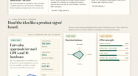
Use maps, heatmaps, and overlays to turn complex geographic data into clear, impactful visual insights.
Understanding risk communication strategies can significantly improve how your message is received and acted upon, making your presentation more impactful. It’s also important to strike a balance between detail and clarity. While you may have access to extensive data, not every detail needs to be shared. Instead, select key indicators that tell the most compelling story about the geographic risk. Use visual summaries, like infographics or simplified dashboards, to present these indicators. Remember, your goal is to make the risk story compelling but straightforward. Overloading your audience with data can dilute your message and cause confusion, so focus on clarity and brevity.
Another effective strategy is framing the risk in terms that matter to your stakeholders. Connect geographic risk to their specific concerns—whether it’s safety, financial impact, or operational continuity. Use real-world scenarios or case studies to illustrate potential consequences, making the risk tangible. When you do this, you help your stakeholders see why they should care, which encourages proactive decision-making.
Ultimately, your presentation should be a clear, concise narrative supported by impactful visuals and grounded in robust risk assessment methods. Keep your message straightforward, focus on what’s most relevant, and use visualization techniques to translate complex data into compelling insights. This approach ensures your stakeholders understand geographic risks without feeling overwhelmed, empowering them to make informed decisions confidently.

Introduction to Spatial Mapping of Biomolecules by Imaging Mass Spectrometry
As an affiliate, we earn on qualifying purchases.
As an affiliate, we earn on qualifying purchases.
Frequently Asked Questions
How Do I Choose the Right Geographic Data Sources?
You choose the right geographic data sources by prioritizing data source credibility, ensuring the information comes from reputable organizations or government agencies. Always perform geographic data validation to confirm accuracy and consistency. Look for sources with transparent methodologies and recent updates. Cross-reference multiple sources to verify data reliability, and select those that align with your project’s scope, making sure your story stays clear and trustworthy without unnecessary complexity.
What Are Common Mistakes in Presenting Geographic Risk?
You might think more data means clearer risk, but overloading with granular details can dilute your message. Common mistakes include ignoring risk perception, making your presentation either too vague or overly complex. Striking the right balance in data granularity helps viewers grasp the risk without confusion. Remember, your goal is clarity, not data overload—so simplify where possible, and always consider how your audience perceives the risk.
How Can I Simplify Complex Geographic Data Effectively?
To simplify complex geographic data, focus on data layering to combine key information visually, making it easier for your audience to grasp relationships. Use risk zoning to highlight high-risk areas clearly, avoiding overwhelming details. Keep your visuals clean with minimal colors and labels, and prioritize the most relevant data points. This approach helps your audience quickly understand geographic risks without getting lost in unnecessary complexity.
What Tools Are Best for Visualizing Geographic Risk?
You should use interactive maps with data layering to visualize geographic risk effectively. Did you know that layers can show flood zones, earthquake hazards, and population density all at once? Tools like ArcGIS, Google Maps, or Mapbox help you create these dynamic visuals. They make complex data accessible, allowing your audience to explore risks intuitively without feeling overwhelmed, making your story clearer and more engaging.
How Do I Address Audience Concerns About Geographic Risk Accuracy?
To address audience skepticism about geographic risk accuracy, you should emphasize data validation processes. Show them how you verify your data through trusted sources and cross-checks. Be transparent about limitations, and provide clear, concise explanations of your methodology. This builds trust and reassures your audience that your assessment is reliable. Engaging them with visual evidence and straightforward language helps overcome doubts and clarifies complex geographic insights effectively.

National Geographic World Wall Map – Executive – Laminated (46 x 30.5 in) (National Geographic Reference Map)
Expertly researched and designed, National Geographic's World Wall Map is the authoritative map of the world by which…
As an affiliate, we earn on qualifying purchases.
As an affiliate, we earn on qualifying purchases.
Conclusion
Remember, simplicity is key when presenting geographic risk. By focusing on clear, relatable stories rather than overwhelming data, you make the risks more tangible and memorable. Think about the real people affected by these risks—how they adapt, survive, or struggle. This human connection can evoke genuine emotion and understanding. Ultimately, showing the truth behind geographic risks helps your audience grasp their significance without overcomplicating the story, inspiring informed action and empathy.

Risks Dashboard A Complete Guide
As an affiliate, we earn on qualifying purchases.
As an affiliate, we earn on qualifying purchases.

Interactive Data Visualization for the Web: An Introduction to Designing with D3
As an affiliate, we earn on qualifying purchases.
As an affiliate, we earn on qualifying purchases.